While I keep up with most technology, if only a step behind sometimes, I don't turn my back on older technology. Some say that print is dying these days and they might be correct, but books will always be around if not in a different form. Some say that you can find anything on the internet and while there is a lot of information on the web that can help you improve you artwork it won't always have all the answers. So it is always good to keep a good library of helpful books about technique and subject matter for you to refer to. With that in mind, here are some of my suggested readings and why to get them.
Framed Ink
Framed Ink is one of my go to books to understanding the tips and a tricks of creating a good composition and visual storytelling. The book is fully illustrated with good compositions which are then broken down into easy to understand visual shapes of those compositions. This is a must have book if you want to start learning to master composition.
A Glossary of Construction, Decoration & Use of Arms & Armor
It is always good to keep good reference material around and as an illustrator I need to be able to cover a lot of subjects. This book by George Cameron Stone is a great book for seeing a large variety of different weapons from throughout history and around the world. It has a ton of photo references from you to draw upon and it is an interesting read. If you do a lot of fantasy work then this is a great addition to your library.
Animal Anatomy for Artist: the Elements of Form
One of the hardest things an artist can master is to correctly draw the human form, but that is only because as humans we will pick at it more. Drawing the anatomy of animals is just as challenging. The book is fully illustrated with a wide variety of different animals, the structure of the bones, their muscle structure and different views to help an artist draw animals more realistically. The only draw back is that it doesn't cover reptile muscle structure, but it does cover birds and a wide variety of mammals. This is a must have and is well worth the cost.
So what is in your library? If anyone knows a good anatomy book that covers reptiles and shows their muscle structure I would love to know about it.
News and updates about my artwork, tutorials, thoughts and other cool stuff.
Showing posts with label composition. Show all posts
Tuesday, May 14, 2013
Friday, March 22, 2013
Arkham: A nice place to Visit: My process
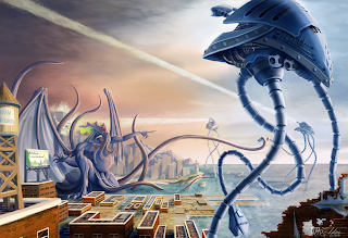
Ever since Mike Davis was kind enough to show my War of the Worlds Vs Cthulhu composition on his website Lovecraft Ezine and on his corresponding Facebook Page it has been getting more coverage than I have ever had before. So I thought it would be a good idea to share a little bit about the process I took in creating it as well as my other art.
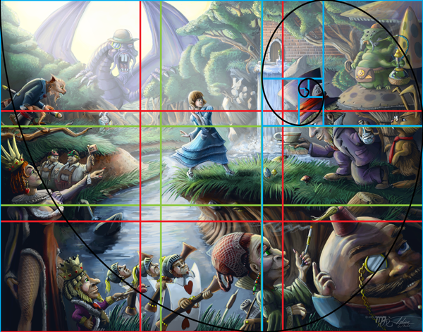
However, before I get to my process I will share a detail that doesn't show up well on the versions that I have up on the internet for viewing. First there is a lot more detail to Cthulhu and second is the billboard advertisement for the fictional Arkham City. While this doesn't show up in most of the web versions, it does show up well on a full size print which can be bought through Zazzle or Deviant Art which you can get to via the page tabs above.
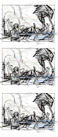
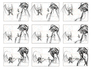
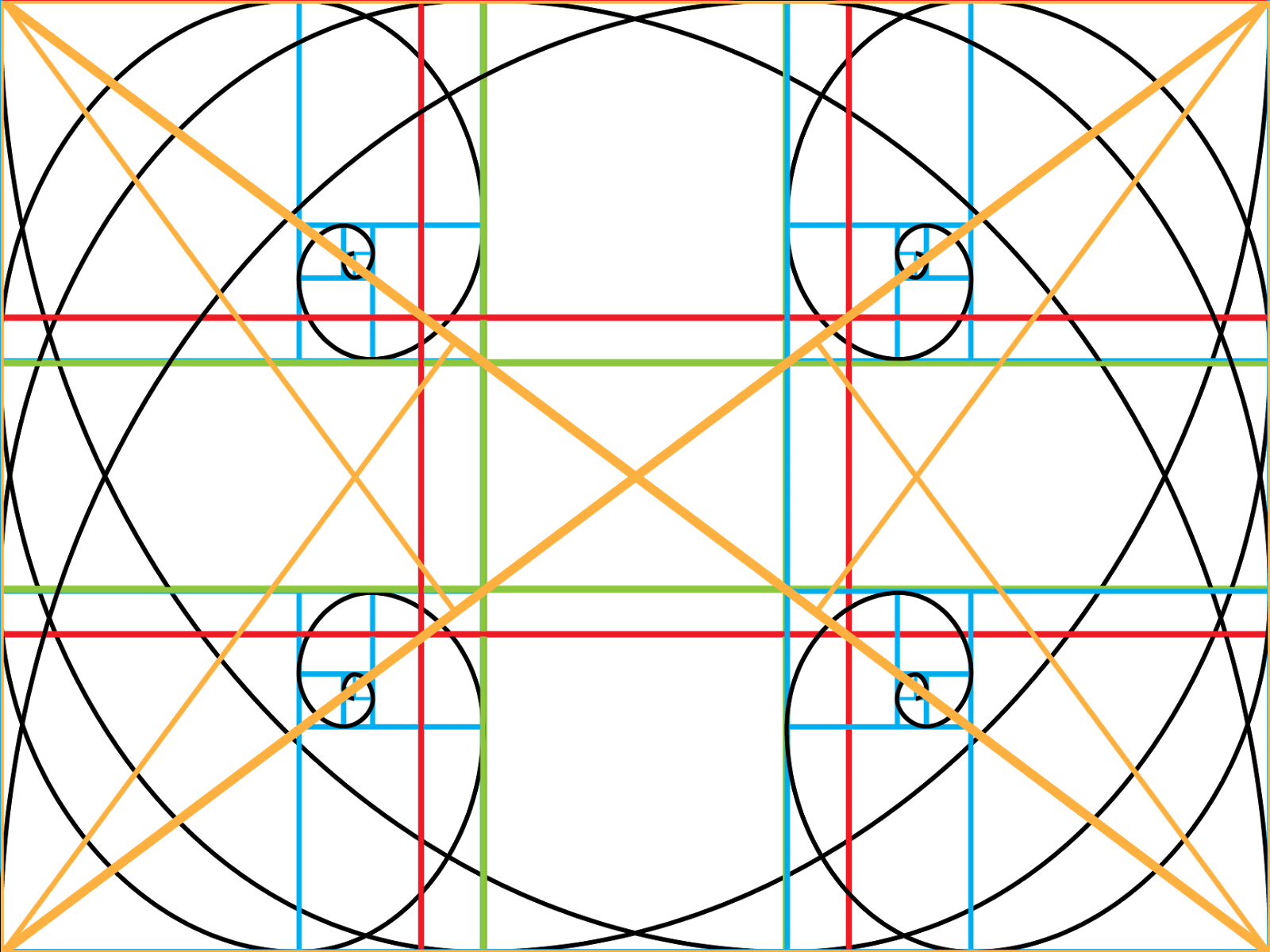
The first step I took when planning this composition is working up some quick thumbnail sketches in Photoshop. The ratio size of these thumbnail sketches are in direct proportion to the size of the canvas that I desired for the final piece. I already had a good idea of what I wanted, because I had visualized it in a dream, so the changes are minor in the variations for these thumbs, but often this process is a brain storming session, because while at times I might have started off with a small seed of an idea, thumbing may allow it to grow into anything. Mostly what I was looking for was positioning and poses for the primary and secondary foci of this composition. To help me with placement I used my golden ratio overlay tools. You can find out more about that on my Golden-Compositions post. After finding the general positioning and poses that I like, I then add in more content with a few more thumbnails for a more complete composition.
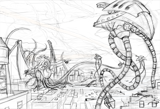
After I choose the final thumbnail sketch I scale this rough sketch up to a large size canvas and refine the sketch more. During this sketch I am looking for a tighter drawing so my concerns are about proper perspective and form since I don't have to worry about the compositional placement anymore. I also add in more details, but I keep these details loose because I don't want to obsess about it; this is a easy trap to fall into and I try to avoid it at all costs. I sketch right into Photoshop via my Wacom tablet and I do so on a transparent layer because this allows me to paint underneath my sketch so that I can keep my drawing separate from my painting, because the last thing you want to do is be destructive to the work you have already done.
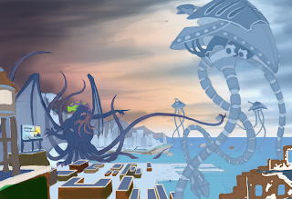
Painting now begins and I start off lowering the opacity of my sketch to around 30% and then lock the layer. I then create a new layer under this and begin painting the local colors I want for all my objects. Sometimes, I will go back and change this as needed. Your local colors are the true color of your objects but they will be effected by the temperature of light and shadow later and so will look very different later on. The only exception I made here was the sky. When I paint skies I just let my intuition take over and taking logic out of the process because doing skies I find to be an abstract experience.

When finished with that I lock my local color layer and then create two new layers over this to start working in light and shadow. One layer is set to multiply at a lower opacity and soft light on the other. To know more about this process you can check out this other article I wrote called color-blending-fx-brushing-and-photos which not only explains the process but also includes video tutorials I have created.

Now that I have color and value down close to what I want, I create merged copy layer of what I have created so far and paint directly on that; this way my canvas becomes my pallet and I don't have to worry about using color swatches. I then clean up and make alteration to color as I think it needs it. I also starting laying in some base texture as a starting point for texture and details. I use these textures merely as a starting point and guide and I paint over this to fit the painting. If you would like to know more about textures then you might check out my texture-hunter part 1.
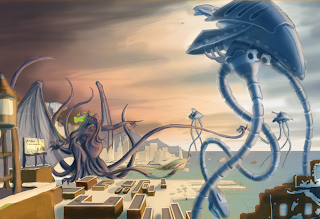
My last step is to bring the painting home, which generally means that I continue painting in refinements, textures and details. The very last effort I made on this painting was to make one more merged copy of the work I had so far and rotated the image a few degrees for a dutch angle to create some mood but the reason I only did this a little bit because I didn't want to throw my compositional placement off. If I find that I cannot figure out what more to do or if I am getting fussy over the painting I walk away from the painting for several hours and then come back to it with fresh eyes.
So I hope you found this interesting and helpful and would be glad to answer any questions so feel free to ask them in the comment box.
Sunday, March 3, 2013
Golden Compositions
Golden Compositions
Most artists have heard of the golden ratio or rule of two-thirds, but not every artist know all the different variations let alone how to use such mathematical tools. In this article I will go over these various tools of Phi and my interpretation on how to and when to use them. Also for the digital artists I have included these files to be transparent PNGs that can easily be adjusted to the area of what ever size canvas you may be working on because when stretch or squashed it will keep the ratio in relation to your canvas, allowing for a quick compositional grid overlay.
The Golden Ratio
The golden ratio is is a grid divided into thirds, with the middle rows being half the size of one of the out rows but when the outer rows are added to the middle then the total length and width are attained in a balanced mathematical proportion with a ratio of 1.68. To use this grid in art, one simply needs to place the focal point of their composition on and around one or more of the intersections of the grid. Another option is to the columns for placement. If one used the center then one can create a power focus but such focus needed only when the subject is overwhelm the audience. For instance the statue of liberty or the Monolith from 2001 space Odyssey.
The Rule of Two-Thirds
This is the cousin of the Golden Ratio and it is used exactly the same way with just a little different placement as the area of the piece is divided equally into thirds.
The Golden Triangle
The Golden Triangle is a little different than the ratios and the point of using this tool is for directional line or for placement that breaks up the piece into thirds. If used for directional line the focal points line up and the intersection and spread out but for placing the images into thirds then one to two of the triangles will contain your focal points but it is best to do this on separate planes.
The Golden Spiral
The bottom one is the one with the transparency
The Golden Spiral is about placement and flow of the picture to help guide the eye of the viewer around the picture plane. This is a powerful grid and it is a form of fractal that can be found all through out nature. From studying various strong compositions and other articles about this tool I can tell you that it is the hardest one to follow, but I hope my understanding will make it clear you you all. The grid itself is based on the golden ratio but it can definitely spiral tighter and tighter and it keeps breaking down . Inside these sections you can place your main focal points of your composition as long as they remain for the most part of the inside track of the spiral that is formed from the cornered points. Secondary focal points can be created by placing them as an intersection along this spiral path which will create flow and guide the eye around your composition.
Down Below are examples of my artwork that show how these grids work for strong compositions.
Also it is important to note that you don't have to limit your self to just one of these tools or the multiple use of the same tool but with different orientation with the only proviso that you do not distort the ratios.
I have included one more transparent ratio grid and that is a master grid that gives all possible orientation, but I would advise starting off with these separately until you understand how they work before trying to use them all at once.
Lastly if you have any questions please feel to ask and I will answer them the best I can. Also I don't claim total knowledge in how the golden ratio can be used and I feel that there are many different methods in using it so if you know something I don't then please share with a comment.
Subscribe to:
Posts (Atom)


