Thursday, April 25, 2013

Imagination, Inspiration, and Creative Blocks Part 2

“Inspiration is for amateurs. The rest of us just show up and get to work. If you wait around for the clouds to part and a bolt of lightening to strike you in the brain, you are not going to make an awful lot of work. All the best ideas come out of the process; they come out of the work itself.”

    Now while I do really appreciate the work that Chuck Close does, but I have to partially disagree with his quote. He is correct that you shouldn’t wait around for inspiration to spontaneously happen, but inspiration is a part of most art forms whether it be visual, musical, literary or even culinary because it is a part of the process. Inspiration is a process within the process of creating art and it is achieved through different methods of exploration.

    Like in my last art blog article I am going to talk about various methods of how to gain inspiration, to flex you imagination or to unclog a creative blog. If you are interested in the prior methods I talked about you can find them here imagination-inspiration-and-creative part 1

Stop Thinking!


    Thinking is overrated when you are trying to achieve something creative. Cognitive thought is only required for helping to solve problems you have not encountered in the past and it takes a lot of energy out of your system in the form of lowered glucose levels. By the time you are done “thinking” about what to do, your energy levels become lowered to the point where you loose the drive and ambition you had when you started the process. If you started the creative process by trying to solve too big of a problem you will find yourself trying to solve and almost impossible problem. Let go, start small, and draw upon what you already know and if that is not enough then go out and experience something new!


Visualize It!

    This technique is similar to daydreaming but is more controlled.  Michelangelo said, “ every block of stone has a statue inside it and it is the task of the sculptor to discover it” and all that we have to do is remove the excess stone. Michelangelo could see the statue in the stone before he sculpted his famous David statue. When you visualize what you want to achieve you are creating an actual long term memory. For years I have often did this naturally and when it occurred it was like I predicted the future. Then when you apply this visualization to other standard processes it is easier to achieve, with less work and greater success. However, visualization is not a short cut for prep work and when creating David, Michelangelo created many mock statues on a smaller scale after visualizing it to help with his process. By visualizing what you want to achieve and to put it into your long term memory you use less of your upper cognitive resources, so start picturing what you want to achieve before you begin work.

Play, Don’t Work!
    There is a big difference between work and play but both can be a productive or unproductive activity. Imagine back when you were a kid on the beach or in a sandbox and you started to build a sand castle or something similar. In its construction, you were in all probability very industrious in its creation but was it labor or play? I would argue, at the time of creation, that sand castle just felt like playing around despite the fact you put so much effort into it. When we play, while we might expend a lot of energy, we often don’t feel to tired even after play, but when we “work”, at a job that you may not like, you use up to many of your resources and become exhausted. When we play or minds are open and pliable but when we “work” our minds become closed and we rely to much on our cognitive minds if we are not use to that work. So, if you find that your current process has become to much of a chore it is a good idea to try and find a way to make it feel fun and a good way to do this is to make it like or similar to a game. If you are not having fun or you don’t even get satisfaction from what you are doing then that task is not really worth doing over and over again, there is no point.

Now of course, I don’t claim to know all there is to know about being creative, but I do try to communicate what I do know on to others. I am also very interested in knowing what you all thinking about being creative and would love to hear from you all.

Wednesday, April 17, 2013

Imagination, Inspiration, and Creative Blocks Part 1

An artist’s greatest tool is having a strong imagination, but it is like a muscle and if it does not get regular exercise then it can atrophy. However, not everyone know’s how to get inspired and even the best creative minds get creative blocks. So I am going to share some of my tips of when I need inspiration or when  I get a block that needs unclogging.


Get Distracted and Letting Go

Creative blocks are often due to the trap of holding onto an idea like an mistreated pit bull. You have convinced yourself that your initial idea is the only possible avenue and thus you have created a sort of tunnel vision keeping you from seeing other possibilities. When this happens, the best suggestion I can make is to walk away from what you are doing and get your mind off the subject. Until you can let go of your initial idea you won’t be able to come up with new ones. A good way to get distracted is to go take a walk or go ride a bicycle. Albert Einstein, a champion of imagination, often stated to go on a bicycle ride to remove blocks. However, getting chores or errands out of the way also helps remove the tunnel vision. Lastly anything that lets you relax and take your mind off things allow you to approach a problem with fresh eyes.

Daydreaming

“Bobby, stop daydreaming and pay attention!”


The Scientifically Proven Benefits of Daydreaming
Sadly our society today has often frowned on the daydreamers, because it doesn’t seem to be evidently productive. However, I disagree and I willing to bet that most creative minds out in the world today will agree with me that it can be one of the more productive initial methods in creative work. Daydreaming is an excellent method in exploring new ideas, because when we daydream it is our own private world where we can shed our hangups, where we are not judged for looking foolish and we can mentally play in any shape or form. Daydreaming, is the ultimate form of brainstorming because it is like writing a movie script that we can quickly rewind, fast forward and edit as we go along. Lastly daydreaming starts off small with a simple idea and it lets you evolve it into a more complex idea that seems more natural and intuitive.

Take the Risk!
The whole attitude that “it will never work” is a bad block to brainstorming.  When brainstorming ideas it is generally a good idea not to automatically discount what you may deem to be an bad or unpopular idea. It is better to lay that idea out there whether it be a fast sketch or a short little line. Even if the idea might not be sound, the idea still may provide a path to a new idea. Also, never be afraid to do something because it has or has not been done before. If it hasn’t been done before then odds are you will grab some kind of audience and if it has been done before then you might be able to put a new spin on it. Desi Arnaz, also known as Ricky Ricardo from the “I Love Lucy Show” was famous for taking risks that no one was willing to try merely because it had never been done before and made it a success.

Make a List of Nouns!

One of my favorite authors, Ray Bradbury, once said that he likes to make a list of nouns for inspiration of what he wanted to write about; the same could be applied to visual artists as well. The idea behind this strategy is to start small or simple so that you have something to build around. Any idea needs a strong foundation before you can build it into something grand. If one tries to create a complex idea right off the start then odds are the idea will not communicate well. For example, I start with the idea I want to do a painting about friendship, this is the core idea, how can I show that, what are some of the actions that friends do, what kind of moods do I want for this act of friendship, and so on and so on.


Tune in!

A great way to get inspired to do something creative is to be inspired by the works of other creative people. These days we are inundated with a barrage of different forms of mediums that convey the collective of our creative minds. Often, I was inspired by a book, a painting, a song, a TV program, a movie, or even a video game to create something creative or interesting. Now a common reaction to this notion is that, “well you are just copying something you saw”, but this is not necessarily the case. When exposed to these mediums it is easy for one to be inspired by the smallest fragment of what you saw, read or heard. This small fragment may have just been a small interesting detail in the original medium, but was not the original idea. Another possibility is that you were inspired by the original idea, but you start to daydream and play the what if game allowing you to put a new spin on the original idea.  Remember, as long as you change an idea enough and make it your own taking ideas from others is not stealing. Imagination is not an internal force, but rather it is a reflection and multi-faceted projection of our experiences and knowledge. We take in information from the world around us and intuitively re-order it into something new. Something is not created from nothing but simply transformed from what was before.

Imagination can even defeat the Boogieman
Now I don’t ever claim to know all there is to being creative or how to unclog a creative block. I am sure many of you out there have tips & tricks of how to be inspired or to stop creative blocks and I invite you all to contribute. Also please feels free to ask any questions you have and I will do my best to answer them.

Tuesday, March 26, 2013

The Art of Critiquing


There is an art to the critique, but over the years I have learned that most people have many misconceptions of how a critique should be given or received.  It took me a while to learn the art of a good critique, but over many years of school and critiquing sessions,  I felt it would be a good idea to share what I have learned. Lastly, it is my intent for this article to be able to work for any medium whether it be the visual arts, music, writing, culinary, performing arts or even a worker's performance in day to day life.

So, what should a critique be? This might seem like a silly question, but I have found that many people confuse a critique with a criticism. This leads many critiques to often tear down the person receiving the critique, when in fact they wanted some constructive feedback so that they can improve.  When someone asks for a critique, they are either asking for a pat on the back, how they can improve or a bit of both. Over the decades it has long been debated in our school system whether it is better to use negative or positive reinforcement. The truth of the matter is that both methods have their merits, but alone they can cause damage. Keeping this in mind, when giving a critique, it is best to give both the pros and the cons. Focusing just on the positive can make the recipient misunderstand the intent of the critique such as: the artist thinks he/she is a professional level artist or that the critic is being insincere. Equally if the critique focuses just on the negative then that artist might end up changing something that was good, especially if there were a lot of negative points, or that artist might even give up all together because of feeling a loss of worth.

A better approach to a critique, is to apply both positive and negative reinforcement. With this approach, the person receiving the critique will be more receptive to the areas that need improvement and in a addition they are more likely to keep the aspects of their work that were successful. Some might argue that this is to avoid hurt feelings, but this is not the case, it is about good communication between the critic and the receiver which in turn will lead to a positive outcome.

There are somethings that a critic should and should not do. A critic should not try to point out a problem if they have no knowledge or experience in that given area, because this will provide bad feedback for the person on the receiving end of the critique. If the critic does detect a problem through intuition, but it is beyond their experience then stating the problem area is acceptable, but it must be pointed out that he/she doesn't have the exact knowledge of what is wrong. If the critic is not only an expert, but is skilled as well, then the critic should explain how to correct what is pointed out. Such an explanation is a courtesy, but is more constructive than without. The critic, however should not be obligated as to the length of such an explanation, if the critic feels any explanation  is needed. It is good form to provide additional explanation or help if the receiver requests such information, but again this is not an obligation.

While I have stated that a balanced critique is one that provides both positive and negative feedback, sometimes this is harder said than done. If as the critic, you can't find any positive thing to say about the receiver's technique and skill, then pointing out the concept of what they were trying to achieve in a positive light can help. If the receiver shows they made a lot of effort in the work they did, then acknowledging that effort can help. If as the critic you can't find any negative feedback then try following up with alternative ideas that fit within the intent of the receiver's work because this might inspire them to reach higher than their current ability.

The receiver of a critique also needs to understand how to receive a critique with grace. First the receiver should keep quite until the critique is finished and to not be quick to defend. In fact, the receiver should not try to defend their work at all, because most of the time they asked for the critique. After the critique is given the receiver may and probably should explain what their intent was in the work that is up for critique. Sometimes this may be given before a critique and it really depends on the protocol that has been established in a session. When the intent is communicated then the critic will understand better and will offer better feedback. This is often needed because the intent is not always apparent. It is good to get critiques from different sources for the same work, because if there are overlapping comments then odds are good that they know what they are talking about. If the receiver feels that the critic is in error then that is fine, but it is bad form to call them out. If the critique is given online then it is fine to check out their work if the receiver needs that validation if the all or part of the critique was thought to be in error due to non-experience; don't accept the talk if they can't walk the walk.

Remember, a critique is not about criticizing, but it is about communication and constructive feedback to help the receiver of the critique improve their skills and knowledge. Hopefully I have covered what makes a good and balanced critique, but life can always throw you a surprise, so please feel free to ask any questions you may have and I will answer it to the best of my ability.

Friday, March 22, 2013

Arkham: A nice place to Visit: My process


        Ever since Mike Davis was kind enough to show my War of the Worlds Vs Cthulhu composition on his website Lovecraft Ezine and on his corresponding Facebook Page it has been getting more coverage than I have ever had before. So I thought it would be a good idea to share a little bit about the process I took in creating it as well as my other art.


However, before I get to my process I will share a detail that doesn't show up well on the versions that I have up on the internet for viewing. First there is a lot more detail to Cthulhu and second is the billboard  advertisement for the fictional Arkham City. While this doesn't show up in most of the web versions, it does show up well on a full size print which can be bought through Zazzle or Deviant Art which you can get to via the page tabs above.


         The first step I took when planning this composition is working up some quick thumbnail sketches in Photoshop. The ratio size of these thumbnail sketches are in direct proportion to the size of the canvas that I desired for the final piece. I already had a good idea of what I wanted, because I had visualized it in a dream, so the changes are minor in the variations for these thumbs, but often this process is a brain storming session, because while at times I might have started off with a small seed of an idea, thumbing may allow it to grow into anything. Mostly what I was looking for was positioning and poses for the primary and secondary foci of this composition. To help me with placement I used my golden ratio overlay tools. You can find out more about that on my Golden-Compositions post. After finding the general positioning and poses that I like, I then add in more content with a few more thumbnails for a more complete composition.

               After I choose the final thumbnail sketch I scale this rough sketch up to a large size canvas and refine the sketch more. During this sketch I am looking for a tighter drawing so my concerns are about proper perspective and form since I don't have to worry about the compositional placement anymore. I also add in more details, but I keep these details loose because I don't want to obsess about it; this is a easy trap to fall into and I try to avoid it at all costs. I sketch right into Photoshop via my Wacom tablet and I do so on a transparent layer because this allows me to paint underneath my sketch so that I can keep my drawing separate from my painting, because the last thing you want to do is be destructive to the work you have already done.


        Painting now begins and I start off  lowering the opacity of my sketch to around 30%  and then lock the layer. I then create a new layer under this and begin painting the local colors I want for all my objects. Sometimes, I will go back and change this as needed. Your local colors are the true color of your objects but they will be effected by the temperature of light and shadow later and so will look very different later on. The only exception I made here was the sky. When I paint skies I just let my intuition take over and taking logic out of the process because doing skies I find to be an abstract experience.


       When finished with that I lock my local color layer and then create two new layers over this to start working in light and shadow. One layer is set to multiply at a lower opacity and soft light on the other. To know more about this process you can check out this other article I wrote called color-blending-fx-brushing-and-photos which not only explains the process but also includes video tutorials I have created.


        Now that I have color and value down close to what I want, I create merged copy layer of what I have created so far and paint directly on that; this way my canvas becomes my pallet and I don't have to worry about using color swatches. I then clean up and make alteration to color as I think it needs it. I also starting laying in some base texture as a starting point for texture and details. I use these textures merely as a starting point and guide and I paint over this to fit the painting.  If you would like to know more about textures then you might check out my texture-hunter part 1.


My last step is to bring the painting home, which generally means that I continue painting in refinements, textures and details. The very last effort I made on this painting was to make one more merged copy of the work I had so far and rotated the image a few degrees for a dutch angle to create some mood but the reason I only did this a little bit because I didn't want to throw my compositional placement off. If I find that I cannot figure out what more to do or if I am getting fussy over the painting I walk away from the painting for several hours and then come back to it with fresh eyes.

So I hope you found this interesting and helpful and would be glad to answer any questions so feel free to ask them in the comment box.

Sunday, March 3, 2013

Golden Compositions


Golden Compositions


Most artists have heard of the golden ratio or rule of two-thirds, but not every artist know all the different variations let alone how to use such mathematical tools. In this article I will go over these various tools of Phi  and my interpretation on how to and when to use them. Also for the digital artists I have included these files to be transparent PNGs that can easily be adjusted to the area of what ever size canvas you may be working on because when stretch or squashed it will keep the ratio in relation to your canvas, allowing for a quick compositional grid overlay.

The Golden Ratio

The golden ratio is is a grid divided into thirds, with the middle rows being half the size of one of the out rows but when the outer rows are added to the middle then the total length and width are attained in a balanced mathematical proportion with a ratio of 1.68. To use this grid in art, one simply needs to place the focal point of their composition on and around one or more of the intersections of the grid. Another option is to the columns for placement. If one used the center then one can create a power focus but such focus needed only when the subject is overwhelm the audience. For instance the statue of liberty or the Monolith from 2001 space Odyssey.
The Rule of Two-Thirds
This is the cousin of the Golden Ratio and it is used exactly the same way with just a little different placement as the area of the piece is divided equally into thirds.  
The Golden Triangle
The Golden Triangle is a little different than the ratios and the point of using this tool is for directional line or for placement that breaks up the piece into thirds. If used for directional line the focal points line up and the intersection and spread out but for placing the images into thirds then one to two of the triangles will contain your focal points but it is best to do this on separate planes.

The Golden Spiral
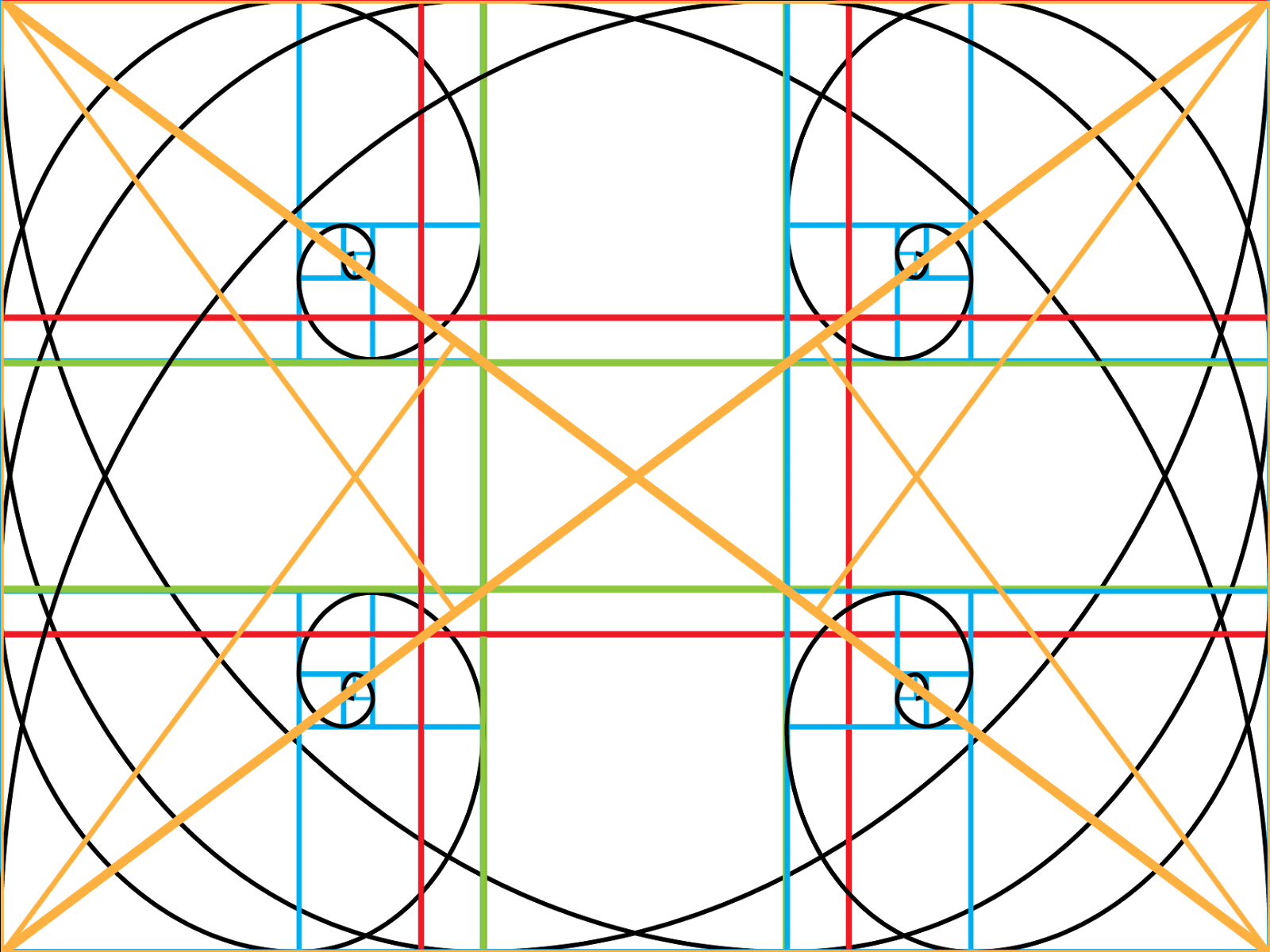
The bottom one is the one with the transparency 
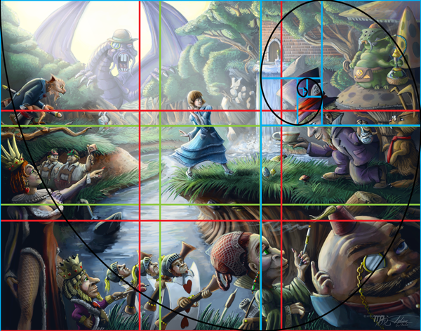
The Golden Spiral is about placement and flow of the picture to help guide the eye of the viewer around the picture plane. This is a powerful grid and it is a form of fractal that can be found all through out nature. From studying various strong compositions and other articles about this tool I can tell you that it is the hardest one to follow, but I hope my understanding will make it clear you you all. The grid itself is based on the golden ratio but it can definitely spiral tighter and tighter and it keeps breaking down . Inside these sections you can place your main focal points of your composition as long as they remain for the most part of the inside track of the spiral that is formed from the cornered points. Secondary focal points can be created by placing them as an intersection along this spiral path which will create flow and guide the eye around your composition.
Down Below are examples of my artwork that show how these grids work for strong compositions.
Also it is important to note that you don't have to limit your self to just one of these tools or the multiple use of the same tool but with different orientation with the only proviso that you do not distort the ratios.


I have included one more transparent ratio grid and that is a master grid that gives all possible orientation, but I would advise starting off with these separately until you understand how they work before trying to use them all at once.


Lastly if you have any questions please feel to ask and I will answer them the best I can. Also I don't claim total knowledge in how the golden ratio can be used and I feel that there are many different methods in using it so if you know something I don't then please share with a comment.


Thursday, February 21, 2013

Contrast in Context

Many of you might know that contrast is important for a good composition, but many do not realize, at least not consciously, is that contrast is a complex beast that comes in many different forms, so there are many ways to achieve contrast to help create a strong composition. The different forms include value contrast, simultaneous contrast (part of color theory), contrast in color saturation, in texture, in detail and in size. While it is not needed to include every form of contrasts, it is needed to have two or three of these forms to create a strong focus in a composition.

The reason contrast helps create focus is because our brains are hardwired to automatically look for differences, which is a human survival trait, so we can use this innate behavior to get our viewers to focus on what we wish. If you like adding lots of hidden detail, don’t worry because they will look at the rest of your image, because while the human eye locks on to differences it is constantly tracking for more information and they will, overtime, discover any little gems you have planted. So lets take some time and examine the different forms of contrast and how they work in creating focus.

Contrast in Value

Of course, this is the most well known form of contrast and the most straight forward. To put value contrast simply; light against dark. If you have an image that has a range of dark values then you want your subject to be significantly lighter in its value range than the rest of your image. A good example would be a man standing in a dark room but he is illuminated by a spot light. If you image is range of mostly light values then you want your subject to be of significantly dark values. Either direction that you use this form of contrast will create more focus for your composition.
Notice how the value of the ship makes it stand out more than what is happening to the right hand side of the painting.

Color Saturation Contrast

This is very similar to value contrast, not only does this help create focus but can also make things look either very drab or very intense depending on the mood you are trying to convey. It works mechanically the same as value contrast.
Notice how the saturation of her skin and umbrella stands out more than the background which is subdued in its saturation.


Simultaneous Contrast

Simultaneous contrast is part of color theory and it occurs when you have one color adjacent, but not overlapping, to its color compliment or analogous compliment. When complimentary or analogous complimentary colors are side by side then those colors appear more vivid to our eyes.  When one of these colors is used in combination with low saturation contrast then the color with stronger saturation becomes vivid, but the complimentary color at low saturation is not noticeable and doesn’t always register as the color it actually is, so you will have a color that is strong, creates focus and one that doesn’t show colors you don’t want to show, but are really there in order to enhance the colors you do want to show.
Notice how the orange and yellow colors stand out and look more vivid against the blue background and vice versa.


Contrast in Texture

Contrast can also be created through the density and different types of texture. The first way to create contrast through texture, is to have your main focus to have significantly more or less texture than the rest of your composition. Another way to create contrast through texture is to have texture that totally differs from your main subject and the rest of your composition. A good example is to have something that is totally smooth like an apple set against a background of stucco wall. The rough texture of the wall will contrast against the smooth skin of the apple, but the difference in texture will also emphasize both textures, so the apple will seem very smooth and the wall very rough. Using texture that opposes each other in extremes like rough to smooth, soft to hard, shiny to dull and so on will produce the most noticeable results.
Notice the smooth and soft texture of the water makes the rocks and shells of the turtles more rough in comparison.


Contrast in Detail

The level between detail and the subject of your composition is another way to achieve focus. The simplest way of course to approach this is through the extreme of having your subject having the most detail versus a background of minimal or suggested detail. We still take in the suggestion of the background which gives our subject context for it’s surroundings and allows us to soak in the level of detail of the subject. The reverse can be done as well but the end result might be different in which the background now becomes a focus, but this can be a good strategy if you want a composition that is a world of a lot of hidden details that your viewers might enjoy.
Notice that Alice is the subject and that she stands out but most of the detail is in the rest of the composition.


Contrast in Size

Lastly we have contrast in size in which your subject is either the smallest but noticeable object in your composition in perhaps in a piece where everything is oversized, for example: a tiny man exploring a desk that looks like it belongs to a giant. Vice versa, you have your subject the largest object in your composition, for example: Godzilla or Cthulhu looming over an entire city. Again this is merely tricking the mind into noticing what is different.
Notice how Cthulhu looms in his size to the city but we also notice the girl because how small she is relative to him and the city.

______________________________

Now most of the examples of contrast I have given out, are of course, are all in the extreme but this is of course just a starting point and often a composition can have more than one focus, so using a variety or different levels of these contrast methods will help, but one mustn’t ignore other tools of composition such as directional line, mass, balance, suggestion of movement and many, many, more compositional tools. If you would like a good book on these compositional tools and rules then I would highly suggest the book Framed Ink “Drawing and composition for visual storytellers by Macross Mateu-Mestre which is jammed packed full of great information

Monday, February 11, 2013

Call of Cthulhu: Legs

I recently just finished up a group of commissioned illustrations for Jim Philips' new Call of Cthulhu adventure book call Legs. This was an enjoyable project to work on, not only because it was Lovecraftian, but also because of the working relationship I developed with Jim and I was impressed to see the final layout of the book combined with my artwork.

This was the final layout for the book and I think it came out looking really good. The adventure book is for the Call of Cthulhu RPG game and it is a free PDF download. Free PDF Download


I took a picture of my own hand holding a scrap of paper for a reference of this shot.


One of the few things that can disturb me as a horror artist and that is critters bursting from the skin so I could relate with this guy.


It is always a challenge to do sexy plus gory at the same time. I also used the Schindler's List trick of just using the color red for this mostly black and white piece.


And yet this guy is not even fully grown yet.


This is the cover with out the text layout, although having the text is really good as well. Not sure what I prefer.