Friday, March 22, 2013

Arkham: A nice place to Visit: My process


        Ever since Mike Davis was kind enough to show my War of the Worlds Vs Cthulhu composition on his website Lovecraft Ezine and on his corresponding Facebook Page it has been getting more coverage than I have ever had before. So I thought it would be a good idea to share a little bit about the process I took in creating it as well as my other art.


However, before I get to my process I will share a detail that doesn't show up well on the versions that I have up on the internet for viewing. First there is a lot more detail to Cthulhu and second is the billboard  advertisement for the fictional Arkham City. While this doesn't show up in most of the web versions, it does show up well on a full size print which can be bought through Zazzle or Deviant Art which you can get to via the page tabs above.


         The first step I took when planning this composition is working up some quick thumbnail sketches in Photoshop. The ratio size of these thumbnail sketches are in direct proportion to the size of the canvas that I desired for the final piece. I already had a good idea of what I wanted, because I had visualized it in a dream, so the changes are minor in the variations for these thumbs, but often this process is a brain storming session, because while at times I might have started off with a small seed of an idea, thumbing may allow it to grow into anything. Mostly what I was looking for was positioning and poses for the primary and secondary foci of this composition. To help me with placement I used my golden ratio overlay tools. You can find out more about that on my Golden-Compositions post. After finding the general positioning and poses that I like, I then add in more content with a few more thumbnails for a more complete composition.

               After I choose the final thumbnail sketch I scale this rough sketch up to a large size canvas and refine the sketch more. During this sketch I am looking for a tighter drawing so my concerns are about proper perspective and form since I don't have to worry about the compositional placement anymore. I also add in more details, but I keep these details loose because I don't want to obsess about it; this is a easy trap to fall into and I try to avoid it at all costs. I sketch right into Photoshop via my Wacom tablet and I do so on a transparent layer because this allows me to paint underneath my sketch so that I can keep my drawing separate from my painting, because the last thing you want to do is be destructive to the work you have already done.


        Painting now begins and I start off  lowering the opacity of my sketch to around 30%  and then lock the layer. I then create a new layer under this and begin painting the local colors I want for all my objects. Sometimes, I will go back and change this as needed. Your local colors are the true color of your objects but they will be effected by the temperature of light and shadow later and so will look very different later on. The only exception I made here was the sky. When I paint skies I just let my intuition take over and taking logic out of the process because doing skies I find to be an abstract experience.


       When finished with that I lock my local color layer and then create two new layers over this to start working in light and shadow. One layer is set to multiply at a lower opacity and soft light on the other. To know more about this process you can check out this other article I wrote called color-blending-fx-brushing-and-photos which not only explains the process but also includes video tutorials I have created.


        Now that I have color and value down close to what I want, I create merged copy layer of what I have created so far and paint directly on that; this way my canvas becomes my pallet and I don't have to worry about using color swatches. I then clean up and make alteration to color as I think it needs it. I also starting laying in some base texture as a starting point for texture and details. I use these textures merely as a starting point and guide and I paint over this to fit the painting.  If you would like to know more about textures then you might check out my texture-hunter part 1.


My last step is to bring the painting home, which generally means that I continue painting in refinements, textures and details. The very last effort I made on this painting was to make one more merged copy of the work I had so far and rotated the image a few degrees for a dutch angle to create some mood but the reason I only did this a little bit because I didn't want to throw my compositional placement off. If I find that I cannot figure out what more to do or if I am getting fussy over the painting I walk away from the painting for several hours and then come back to it with fresh eyes.

So I hope you found this interesting and helpful and would be glad to answer any questions so feel free to ask them in the comment box.

Sunday, March 3, 2013

Golden Compositions


Golden Compositions


Most artists have heard of the golden ratio or rule of two-thirds, but not every artist know all the different variations let alone how to use such mathematical tools. In this article I will go over these various tools of Phi  and my interpretation on how to and when to use them. Also for the digital artists I have included these files to be transparent PNGs that can easily be adjusted to the area of what ever size canvas you may be working on because when stretch or squashed it will keep the ratio in relation to your canvas, allowing for a quick compositional grid overlay.

The Golden Ratio

The golden ratio is is a grid divided into thirds, with the middle rows being half the size of one of the out rows but when the outer rows are added to the middle then the total length and width are attained in a balanced mathematical proportion with a ratio of 1.68. To use this grid in art, one simply needs to place the focal point of their composition on and around one or more of the intersections of the grid. Another option is to the columns for placement. If one used the center then one can create a power focus but such focus needed only when the subject is overwhelm the audience. For instance the statue of liberty or the Monolith from 2001 space Odyssey.
The Rule of Two-Thirds
This is the cousin of the Golden Ratio and it is used exactly the same way with just a little different placement as the area of the piece is divided equally into thirds.  
The Golden Triangle
The Golden Triangle is a little different than the ratios and the point of using this tool is for directional line or for placement that breaks up the piece into thirds. If used for directional line the focal points line up and the intersection and spread out but for placing the images into thirds then one to two of the triangles will contain your focal points but it is best to do this on separate planes.

The Golden Spiral
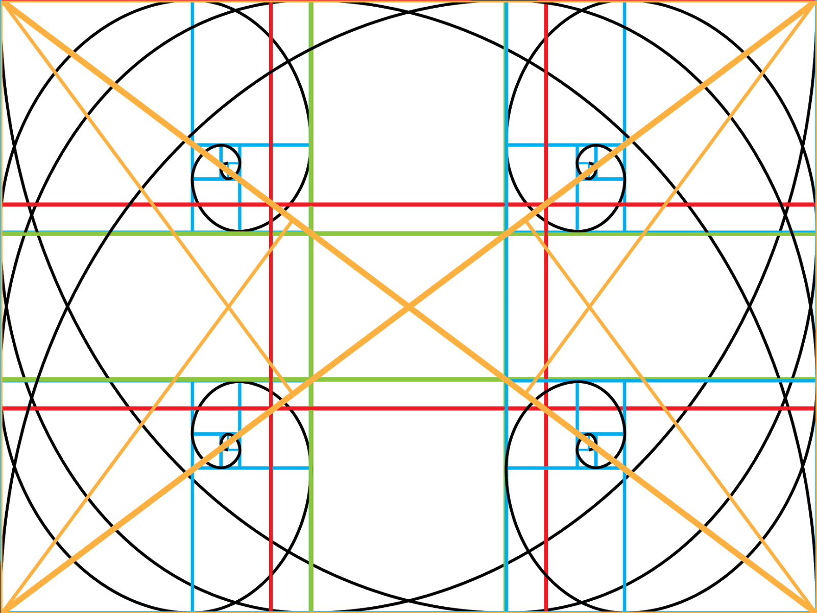
The bottom one is the one with the transparency 
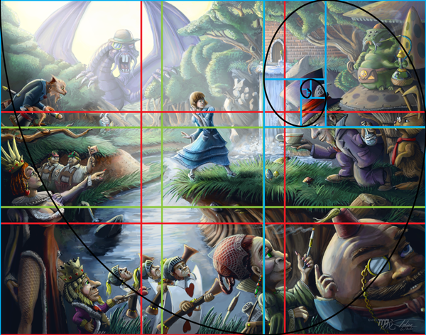
The Golden Spiral is about placement and flow of the picture to help guide the eye of the viewer around the picture plane. This is a powerful grid and it is a form of fractal that can be found all through out nature. From studying various strong compositions and other articles about this tool I can tell you that it is the hardest one to follow, but I hope my understanding will make it clear you you all. The grid itself is based on the golden ratio but it can definitely spiral tighter and tighter and it keeps breaking down . Inside these sections you can place your main focal points of your composition as long as they remain for the most part of the inside track of the spiral that is formed from the cornered points. Secondary focal points can be created by placing them as an intersection along this spiral path which will create flow and guide the eye around your composition.
Down Below are examples of my artwork that show how these grids work for strong compositions.
Also it is important to note that you don't have to limit your self to just one of these tools or the multiple use of the same tool but with different orientation with the only proviso that you do not distort the ratios.


I have included one more transparent ratio grid and that is a master grid that gives all possible orientation, but I would advise starting off with these separately until you understand how they work before trying to use them all at once.


Lastly if you have any questions please feel to ask and I will answer them the best I can. Also I don't claim total knowledge in how the golden ratio can be used and I feel that there are many different methods in using it so if you know something I don't then please share with a comment.


Thursday, February 21, 2013

Contrast in Context

Many of you might know that contrast is important for a good composition, but many do not realize, at least not consciously, is that contrast is a complex beast that comes in many different forms, so there are many ways to achieve contrast to help create a strong composition. The different forms include value contrast, simultaneous contrast (part of color theory), contrast in color saturation, in texture, in detail and in size. While it is not needed to include every form of contrasts, it is needed to have two or three of these forms to create a strong focus in a composition.

The reason contrast helps create focus is because our brains are hardwired to automatically look for differences, which is a human survival trait, so we can use this innate behavior to get our viewers to focus on what we wish. If you like adding lots of hidden detail, don’t worry because they will look at the rest of your image, because while the human eye locks on to differences it is constantly tracking for more information and they will, overtime, discover any little gems you have planted. So lets take some time and examine the different forms of contrast and how they work in creating focus.

Contrast in Value

Of course, this is the most well known form of contrast and the most straight forward. To put value contrast simply; light against dark. If you have an image that has a range of dark values then you want your subject to be significantly lighter in its value range than the rest of your image. A good example would be a man standing in a dark room but he is illuminated by a spot light. If you image is range of mostly light values then you want your subject to be of significantly dark values. Either direction that you use this form of contrast will create more focus for your composition.
Notice how the value of the ship makes it stand out more than what is happening to the right hand side of the painting.

Color Saturation Contrast

This is very similar to value contrast, not only does this help create focus but can also make things look either very drab or very intense depending on the mood you are trying to convey. It works mechanically the same as value contrast.
Notice how the saturation of her skin and umbrella stands out more than the background which is subdued in its saturation.


Simultaneous Contrast

Simultaneous contrast is part of color theory and it occurs when you have one color adjacent, but not overlapping, to its color compliment or analogous compliment. When complimentary or analogous complimentary colors are side by side then those colors appear more vivid to our eyes.  When one of these colors is used in combination with low saturation contrast then the color with stronger saturation becomes vivid, but the complimentary color at low saturation is not noticeable and doesn’t always register as the color it actually is, so you will have a color that is strong, creates focus and one that doesn’t show colors you don’t want to show, but are really there in order to enhance the colors you do want to show.
Notice how the orange and yellow colors stand out and look more vivid against the blue background and vice versa.


Contrast in Texture

Contrast can also be created through the density and different types of texture. The first way to create contrast through texture, is to have your main focus to have significantly more or less texture than the rest of your composition. Another way to create contrast through texture is to have texture that totally differs from your main subject and the rest of your composition. A good example is to have something that is totally smooth like an apple set against a background of stucco wall. The rough texture of the wall will contrast against the smooth skin of the apple, but the difference in texture will also emphasize both textures, so the apple will seem very smooth and the wall very rough. Using texture that opposes each other in extremes like rough to smooth, soft to hard, shiny to dull and so on will produce the most noticeable results.
Notice the smooth and soft texture of the water makes the rocks and shells of the turtles more rough in comparison.


Contrast in Detail

The level between detail and the subject of your composition is another way to achieve focus. The simplest way of course to approach this is through the extreme of having your subject having the most detail versus a background of minimal or suggested detail. We still take in the suggestion of the background which gives our subject context for it’s surroundings and allows us to soak in the level of detail of the subject. The reverse can be done as well but the end result might be different in which the background now becomes a focus, but this can be a good strategy if you want a composition that is a world of a lot of hidden details that your viewers might enjoy.
Notice that Alice is the subject and that she stands out but most of the detail is in the rest of the composition.


Contrast in Size

Lastly we have contrast in size in which your subject is either the smallest but noticeable object in your composition in perhaps in a piece where everything is oversized, for example: a tiny man exploring a desk that looks like it belongs to a giant. Vice versa, you have your subject the largest object in your composition, for example: Godzilla or Cthulhu looming over an entire city. Again this is merely tricking the mind into noticing what is different.
Notice how Cthulhu looms in his size to the city but we also notice the girl because how small she is relative to him and the city.

______________________________

Now most of the examples of contrast I have given out, are of course, are all in the extreme but this is of course just a starting point and often a composition can have more than one focus, so using a variety or different levels of these contrast methods will help, but one mustn’t ignore other tools of composition such as directional line, mass, balance, suggestion of movement and many, many, more compositional tools. If you would like a good book on these compositional tools and rules then I would highly suggest the book Framed Ink “Drawing and composition for visual storytellers by Macross Mateu-Mestre which is jammed packed full of great information

Monday, February 11, 2013

Call of Cthulhu: Legs

I recently just finished up a group of commissioned illustrations for Jim Philips' new Call of Cthulhu adventure book call Legs. This was an enjoyable project to work on, not only because it was Lovecraftian, but also because of the working relationship I developed with Jim and I was impressed to see the final layout of the book combined with my artwork.

This was the final layout for the book and I think it came out looking really good. The adventure book is for the Call of Cthulhu RPG game and it is a free PDF download. Free PDF Download


I took a picture of my own hand holding a scrap of paper for a reference of this shot.


One of the few things that can disturb me as a horror artist and that is critters bursting from the skin so I could relate with this guy.


It is always a challenge to do sexy plus gory at the same time. I also used the Schindler's List trick of just using the color red for this mostly black and white piece.


And yet this guy is not even fully grown yet.


This is the cover with out the text layout, although having the text is really good as well. Not sure what I prefer.


Monday, January 28, 2013

Color Blending, FX Brushing and Photos for Texture

Hi Everyone,


For this week's blog I thought I would do a demo covering how to create light and shadow with color instead of just value and various texture techniques using Adobe Photoshop CS 5 and lower. In this demo you will see how to use the color blend mode for layers, how to use the FX options with your brush strokes and color blend mode, and how to use photos for texture using the color blend mode. These were techniques that I learned and adapted from my illustration professors Cliff Cramp and Christian Hill at Cal State Fullerton. I have broken up the tutorial into three sections because of duration limitations on You Tube. I would suggest viewing these demos at a high resolution so that you can properly see the settings. These demos only go over the very basics but they do give insight of how to approach digital painting.

Friday, January 25, 2013

Leaps, bounds and Muscle Memory

    For all the artists out there, frustrated that perhaps their skills are not growing fast enough, I give the advice of patience and diligence. While this advice might seem pat, I can assure you that this advice is sound for it is backed up from my talks with other artists about our shared personal experiences. The skills of some artist’s you see, grow at a slow and steady pace as they garner their art education and this is reflected in their work which slowly plateaus, but other people on the other hand learn by what I call “Leaps and Bounds” from which seemingly, from time to time, to spontaneously increase in skill.

    “Leaps and Bounds” in this case is a misnomer, it only appears to others, and sometimes even to yourself, that your skills periodically and spontaneously increase in level, which is then followed by a plateau time period before the next jump. What is really happening is that the education learned from teachers, peers and self-education has only laid dormant, then to surface when the artist is ready. The “ready” moment, varies from artist to artist and often won’t show for months or even years, so these artists need to learn a lot of patience. However, this plateau period of little or no growth is just an incubation period for the conscious and subconscious is assimilating the information, assembling its self like a jigsaw puzzle, then when the artist is ready to leave their comfort zone, those skills come forth in a epiphanic bloom.

    The “Leaps and Bounds” artist have the advantage of continued and ever climbing growth, but this is a double edge sword, for if the artist stops painting or drawing they start to go down hill and must re-learn everything once again. So, it is vital that artists who learn this way to maintain their skills and keep up the effort to always learn more about their craft. The diligent artist, no matter how they learn, gain a secondary skill which is called muscle memory, yet another misnomer. Actually, muscle memory crosses over into any skill and it is gain merely from everyday practice. You know when a skill has become muscle memory when you switch from thinking about what you are doing and not how you are doing it. For artists, muscle memory takes many years to totally sink in, but when it does, the artist’s art is like a bird released from a cage.

    So to all those frustrated artists out there who think their skills are not improving, hang in there, don’t give up and keep up the diligence, for you will never know when you will have a “Leaps and Bound”.

Sunday, January 20, 2013

Digital Freehand Inking With Adobe Illustrator

Being a good inker is a valuable skill as either a comic book artist, graphic designer or an illustrator. While traditional inking skills with brush and pen makes for a good solid foundation, having digital inking skills in today's day and age is a must. When it comes to digital inking, knowing how to handle the pen tool is a must and it was something I quickly had to learn during my internship at MGA Entertainment, however using the pen tool, while can give you a lot of control, also takes a lot of time and has it's own problems. The ability to ink fast is another skill that is a must in the art world, because let's face it, the faster you can do quality work the more money you can make. So in this video I am showing how to digitally ink using the blob tool which is more intuitive and has a more natural look. In this video I have used a Cthulhu sketch I did for T-shirt flair in my new clothing line I am calling Lovecraftian Flair.