Showing posts with label illustration. Show all posts

Monday, March 16, 2015

Cthulhian Priests, A Group of Geeks and Kickstarters

Cthulhian Priests, A Group of Geeks and Kickstarters

So it has been a busy week for me working on kickstarters, painting Cthulhian Priests to get away from kickstarters and forming a new facebook group because I couldn't find one like it. 


 So I thought I would start things off by taking you through the process I did for the Cthulhian priest. The piece actually started many years ago and was a sketch from the first page of my travel sketch book!


So I took the face of that old sketch into photoshop and refined it as well as adding on a posed body. For some reason I was in a Nehru jacket mood so I designed his robe that way. I think it was because I was remembering a Weird Al Song.
Once the sketch was done I did a highly refined value painting of him. To get here I start of the values very softly and in general and then I slowly start tightening up the image into sharp details.
Then using an old photo as reference I took while down in la Jolla cove visiting some good friends I painted an alien world, because any good Lovecraftian will tell you that Cthulhu is just a powerful (godlike) alien and his race is called the Star Spawn. This guy is not Star Spawn but he is related!
I then start washing over the value painting with local or base colors for atmosphere and color balance. When I choose my base colors I am often looking for simultaneous contrast which is a fancy artist term for colors making each other look more vivid by being next to each other.
After laying out out the base colors I threw in a little pattern design to the robe to make it look richer.
 After the robes I start adding more color by adding warm color to the light side of my image and cool colors for the shadow sides of my image. This is one of my favorite parts because it helps bring the image to life!
Lastly comes the final touches, color adjustments, clean up, polishing and final little details! This painting took me all day and I needed that distraction from stress of Kickstarter work.


Toward the end of the week I was looking for Facebook groups to join and I wanted a group that was all about being a geek which I am proud to call myself through and through, but the sad panda cried because I could not find one. So what to do? Well create one of course!

I created We Be Geek to be a safe group in which geeks can share general geekiness with other fellow geeks. There are Facebook groups all over that are very specific in their geek interests, but I felt that a lot of geek interests overlap. By the 3rd day we have already gained 131 members! We talk about all kinds of things from video games, cult movie classics, roleplaying games, cool art, science and more! I have even set the rules for limited self-promotion as long as it is geeky in nature or can help geeks out!

If you become an active member you will also receive an official Geek card with your picture, name and Geek number! Everyone loves them! To get one all you have to do is be a member, be active and show you can get your Geek on! I will then make one for you!


So if you are on Facebook be sure to drop by the group, check out all the fun we are having and feel free to join! All are welcome!    We Be Geek!

__________________________________________________________

Last but not least, as some of you know or don't know is that for the past 27 days Nathan Maher and I have been running a kickstarter for the first expansion to the game Spooks! Welcome to the Great Beyond! The Kickstarter for Mortal Intrusion is to pay for the time that I can do the artwork, but the writing I am doing for free as I am the coauthor of the book this time! Good art takes time and time requires money which is why we are holding the kickstarter, not only will it be paying for the artwork but also for the publishing costs and goodies we are offering. We want to produce a quality product and while we have met our KS goal, it is only the barebones funds we need to really produce a high quality product so we need more funds.

 Be awesome in what you do and become a backer, share this blog or post in FB or do both to help us reach those stretch goals! Those who become financial backers get great rewards, but you better hurry because we only have about 3 days left!

If you have any questions please feel free to ask them!


Sunday, March 8, 2015

Evolution of Cthulhu & Concept Art

Evolution of Cthulhu and Concept Art

I am going to take you on a little journey of the art and design of Cthulhu who has over the years been my most prominent painting subject. For those of you know don't know Cthulhu is H.P. Lovecraft's most famous creation despite the fact that Cthulhu only  appeared Lovecraft novel The Call of Cthulhu. While self training and going to college to gain my artistic skills I had decided  to sharpen my ability to perform as concept artist by working from his prose alone and to not to follow the crowd of previous depictions. Cthulhu has been and always will be my on going project. 

The Old one were, the Old Ones are, 
and the Old Ones shall be.


Cthulhu Rising
 My first attempts at painting Cthulhu was primitive at best because painting skill aside I really didn't understand my subject nor did I understand the process of doing concept art or the finer aspects of composition. This was actually before I had even read Lovecraft's work and I only saw the works of others and thought he was cool.


Star Spawn
My second attempt was after I actually started researching and reading Lovecraft's work and I started to understand a little more about Lovecraft's vision. This piece for example is a Starspawn part of Cthulhu's race once I learned that Cthulhu is actually an alien from another world, but his power was so great that he was elevated to godhood status by mankind. As you can see my skill was improving but I was also trying to break free from the depictions other artists have done in the past.


I did this piece when I finally started to understand the need of a visual narrative of an illustration and concept piece. I learned that I had to stimulate the imaginations of my viewers with my work in order to engage them. I kept things simple and straight forward and the feedback I got from this attempt was positive. It was then that I started to learn that I can't operate in a vacuum and needed feedback from my audience.
Lovecraft's Original Sketch


             Wishful Thinking 
Blind Perspective

About this time I was exploring Cthulhu's design even more, but this time I allowed to look at only one visual depiction and that was from Lovecraft's own sketch of how he saw Cthulhu looking. Also during this time I was really learning how to push my rendering skills and exploring in techniques of color and rendering.


Cthulhu Concept
In this design I was trying to break away from the conventional presentations of how Cthulhu was suppose to look like. At this point in time I ended up view other Cthulhu depictions. I think at the time I was also being influenced by other movies. For instance, I forget the name of the movie but it showed a dragon that had feather like wings that were actually scales.


Ends to a Mean
Once again I was exploring the narrative and to this day I found that being able to show a narrative is not only important for illustration but also for concept art and for the very same reasons. One of illustration and concept artwork most important aspects is the need to communicate to the viewer whether it be a general audience or an art director. This piece was also about having fun as it is bit of fan art when you notice the cube the little girl is holding is the puzzle box from the Movie Hell Raiser.


Cthulhu Sketch
This piece actually was a sketch I did during a lecture in one of my art classes, but I was paying attention, honest! This was an important design because I had started to to get tunnel vision in my design and I started to let go. When I mean by tunnel vision I mean it was the only solution I felt was worth exploring or I felt that would work. Letting go of such perceptions is probably one of the hardest things to do in order to become a good concept artist because you have to be able to present different variations of a single subject in order to get the desired result.


Cthulhu's Uninvited 
Again in this piece I was exploring the narrative more and a bit of design as well. I was also returning to the literary description as it described Cthulhu having scales.


Wishful Thinking 2
Here I returned to this piece knowing sometimes going back and doing it again is a good thing and that you don't want to throw away a good thing just for the sake of progress.


Lastly here is my latest concept design of Cthulhu. Again I was letting go of previous design, but I returned to some of the more literary descriptions of Cthulhu by Lovecraft, but also based on feedback and discussions with fellow Lovecraftians. Again here you see my skill has improved considerably and this is due to time of constantly doing art, but also the contracted speculation work I have been doing for MMOmagic as a concept artist which hopefully will pay off someday soon or at the very least has been giving me experience as a concept artist.
Cthulhu Concept
Today I still work as a freelance artist and I don't always know where the money is coming as commissions come in sporadically which makes it hard to pay the bills. In order to counter balance this I have to work with my clients which include helping them or working with them for kickstarter projects like the one below. Please help by becoming a risk free money backer, by sharing this blog on various social media such as Facebook, twitter and more, or be excellent by doing both!


Tuesday, May 14, 2013

Suggested Reading: Act 1

While I keep up with most technology, if only a step behind sometimes, I don't turn my back on older technology. Some say that print is dying these days and they might be correct, but books will always be around if not in a different form. Some say that you can find anything on the internet and while there is a lot of information on the web that can help you improve you artwork it won't always have all the answers. So it is always good to keep a good library of helpful books about technique and subject matter for you to refer to. With that in mind, here are some of my suggested readings and why to get them.

Framed Ink
 Framed Ink is one of my go to books to understanding the tips and a tricks of creating a good composition and visual storytelling. The book is fully illustrated with good compositions which are then broken down into easy to understand visual shapes of those compositions. This is a must have book if you want to start learning to master composition.


A Glossary of Construction, Decoration & Use of Arms & Armor
It is always good to keep good reference material around and as an illustrator I need to be able to cover a lot of subjects. This book by George Cameron Stone is a great book for seeing a large variety of different weapons from throughout history and around the world. It has a ton of photo references from you to draw upon and it is an interesting read. If you do a lot of  fantasy work then this is a great addition to your library.


Animal Anatomy for Artist: the Elements of Form
 One of the hardest things an artist can master is to correctly draw the human form, but that is only because as humans we will pick at it more. Drawing the anatomy of animals is just as challenging. The book is fully illustrated with a wide variety of different animals, the structure of the bones, their muscle structure and different views to help an artist draw animals more realistically. The only draw back is that it doesn't cover reptile muscle structure, but it does cover birds and a wide variety of mammals. This is a must have and is well worth the cost.


So what is in your library? If anyone knows a good anatomy book that covers reptiles and shows their muscle structure I would love to know about it.

Wednesday, April 17, 2013

Imagination, Inspiration, and Creative Blocks Part 1

An artist’s greatest tool is having a strong imagination, but it is like a muscle and if it does not get regular exercise then it can atrophy. However, not everyone know’s how to get inspired and even the best creative minds get creative blocks. So I am going to share some of my tips of when I need inspiration or when  I get a block that needs unclogging.


Get Distracted and Letting Go

Creative blocks are often due to the trap of holding onto an idea like an mistreated pit bull. You have convinced yourself that your initial idea is the only possible avenue and thus you have created a sort of tunnel vision keeping you from seeing other possibilities. When this happens, the best suggestion I can make is to walk away from what you are doing and get your mind off the subject. Until you can let go of your initial idea you won’t be able to come up with new ones. A good way to get distracted is to go take a walk or go ride a bicycle. Albert Einstein, a champion of imagination, often stated to go on a bicycle ride to remove blocks. However, getting chores or errands out of the way also helps remove the tunnel vision. Lastly anything that lets you relax and take your mind off things allow you to approach a problem with fresh eyes.

Daydreaming

“Bobby, stop daydreaming and pay attention!”


The Scientifically Proven Benefits of Daydreaming
Sadly our society today has often frowned on the daydreamers, because it doesn’t seem to be evidently productive. However, I disagree and I willing to bet that most creative minds out in the world today will agree with me that it can be one of the more productive initial methods in creative work. Daydreaming is an excellent method in exploring new ideas, because when we daydream it is our own private world where we can shed our hangups, where we are not judged for looking foolish and we can mentally play in any shape or form. Daydreaming, is the ultimate form of brainstorming because it is like writing a movie script that we can quickly rewind, fast forward and edit as we go along. Lastly daydreaming starts off small with a simple idea and it lets you evolve it into a more complex idea that seems more natural and intuitive.

Take the Risk!
The whole attitude that “it will never work” is a bad block to brainstorming.  When brainstorming ideas it is generally a good idea not to automatically discount what you may deem to be an bad or unpopular idea. It is better to lay that idea out there whether it be a fast sketch or a short little line. Even if the idea might not be sound, the idea still may provide a path to a new idea. Also, never be afraid to do something because it has or has not been done before. If it hasn’t been done before then odds are you will grab some kind of audience and if it has been done before then you might be able to put a new spin on it. Desi Arnaz, also known as Ricky Ricardo from the “I Love Lucy Show” was famous for taking risks that no one was willing to try merely because it had never been done before and made it a success.

Make a List of Nouns!

One of my favorite authors, Ray Bradbury, once said that he likes to make a list of nouns for inspiration of what he wanted to write about; the same could be applied to visual artists as well. The idea behind this strategy is to start small or simple so that you have something to build around. Any idea needs a strong foundation before you can build it into something grand. If one tries to create a complex idea right off the start then odds are the idea will not communicate well. For example, I start with the idea I want to do a painting about friendship, this is the core idea, how can I show that, what are some of the actions that friends do, what kind of moods do I want for this act of friendship, and so on and so on.


Tune in!

A great way to get inspired to do something creative is to be inspired by the works of other creative people. These days we are inundated with a barrage of different forms of mediums that convey the collective of our creative minds. Often, I was inspired by a book, a painting, a song, a TV program, a movie, or even a video game to create something creative or interesting. Now a common reaction to this notion is that, “well you are just copying something you saw”, but this is not necessarily the case. When exposed to these mediums it is easy for one to be inspired by the smallest fragment of what you saw, read or heard. This small fragment may have just been a small interesting detail in the original medium, but was not the original idea. Another possibility is that you were inspired by the original idea, but you start to daydream and play the what if game allowing you to put a new spin on the original idea.  Remember, as long as you change an idea enough and make it your own taking ideas from others is not stealing. Imagination is not an internal force, but rather it is a reflection and multi-faceted projection of our experiences and knowledge. We take in information from the world around us and intuitively re-order it into something new. Something is not created from nothing but simply transformed from what was before.

Imagination can even defeat the Boogieman
Now I don’t ever claim to know all there is to being creative or how to unclog a creative block. I am sure many of you out there have tips & tricks of how to be inspired or to stop creative blocks and I invite you all to contribute. Also please feels free to ask any questions you have and I will do my best to answer them.

Sunday, March 3, 2013

Golden Compositions


Golden Compositions


Most artists have heard of the golden ratio or rule of two-thirds, but not every artist know all the different variations let alone how to use such mathematical tools. In this article I will go over these various tools of Phi  and my interpretation on how to and when to use them. Also for the digital artists I have included these files to be transparent PNGs that can easily be adjusted to the area of what ever size canvas you may be working on because when stretch or squashed it will keep the ratio in relation to your canvas, allowing for a quick compositional grid overlay.

The Golden Ratio

The golden ratio is is a grid divided into thirds, with the middle rows being half the size of one of the out rows but when the outer rows are added to the middle then the total length and width are attained in a balanced mathematical proportion with a ratio of 1.68. To use this grid in art, one simply needs to place the focal point of their composition on and around one or more of the intersections of the grid. Another option is to the columns for placement. If one used the center then one can create a power focus but such focus needed only when the subject is overwhelm the audience. For instance the statue of liberty or the Monolith from 2001 space Odyssey.
The Rule of Two-Thirds
This is the cousin of the Golden Ratio and it is used exactly the same way with just a little different placement as the area of the piece is divided equally into thirds.  
The Golden Triangle
The Golden Triangle is a little different than the ratios and the point of using this tool is for directional line or for placement that breaks up the piece into thirds. If used for directional line the focal points line up and the intersection and spread out but for placing the images into thirds then one to two of the triangles will contain your focal points but it is best to do this on separate planes.

The Golden Spiral
The bottom one is the one with the transparency 
The Golden Spiral is about placement and flow of the picture to help guide the eye of the viewer around the picture plane. This is a powerful grid and it is a form of fractal that can be found all through out nature. From studying various strong compositions and other articles about this tool I can tell you that it is the hardest one to follow, but I hope my understanding will make it clear you you all. The grid itself is based on the golden ratio but it can definitely spiral tighter and tighter and it keeps breaking down . Inside these sections you can place your main focal points of your composition as long as they remain for the most part of the inside track of the spiral that is formed from the cornered points. Secondary focal points can be created by placing them as an intersection along this spiral path which will create flow and guide the eye around your composition.
Down Below are examples of my artwork that show how these grids work for strong compositions.
Also it is important to note that you don't have to limit your self to just one of these tools or the multiple use of the same tool but with different orientation with the only proviso that you do not distort the ratios.


I have included one more transparent ratio grid and that is a master grid that gives all possible orientation, but I would advise starting off with these separately until you understand how they work before trying to use them all at once.


Lastly if you have any questions please feel to ask and I will answer them the best I can. Also I don't claim total knowledge in how the golden ratio can be used and I feel that there are many different methods in using it so if you know something I don't then please share with a comment.


Thursday, February 21, 2013

Contrast in Context

Many of you might know that contrast is important for a good composition, but many do not realize, at least not consciously, is that contrast is a complex beast that comes in many different forms, so there are many ways to achieve contrast to help create a strong composition. The different forms include value contrast, simultaneous contrast (part of color theory), contrast in color saturation, in texture, in detail and in size. While it is not needed to include every form of contrasts, it is needed to have two or three of these forms to create a strong focus in a composition.

The reason contrast helps create focus is because our brains are hardwired to automatically look for differences, which is a human survival trait, so we can use this innate behavior to get our viewers to focus on what we wish. If you like adding lots of hidden detail, don’t worry because they will look at the rest of your image, because while the human eye locks on to differences it is constantly tracking for more information and they will, overtime, discover any little gems you have planted. So lets take some time and examine the different forms of contrast and how they work in creating focus.

Contrast in Value

Of course, this is the most well known form of contrast and the most straight forward. To put value contrast simply; light against dark. If you have an image that has a range of dark values then you want your subject to be significantly lighter in its value range than the rest of your image. A good example would be a man standing in a dark room but he is illuminated by a spot light. If you image is range of mostly light values then you want your subject to be of significantly dark values. Either direction that you use this form of contrast will create more focus for your composition.
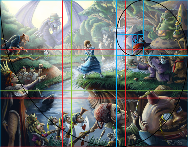
Notice how the value of the ship makes it stand out more than what is happening to the right hand side of the painting.

Color Saturation Contrast

This is very similar to value contrast, not only does this help create focus but can also make things look either very drab or very intense depending on the mood you are trying to convey. It works mechanically the same as value contrast.
Notice how the saturation of her skin and umbrella stands out more than the background which is subdued in its saturation.


Simultaneous Contrast

Simultaneous contrast is part of color theory and it occurs when you have one color adjacent, but not overlapping, to its color compliment or analogous compliment. When complimentary or analogous complimentary colors are side by side then those colors appear more vivid to our eyes.  When one of these colors is used in combination with low saturation contrast then the color with stronger saturation becomes vivid, but the complimentary color at low saturation is not noticeable and doesn’t always register as the color it actually is, so you will have a color that is strong, creates focus and one that doesn’t show colors you don’t want to show, but are really there in order to enhance the colors you do want to show.
Notice how the orange and yellow colors stand out and look more vivid against the blue background and vice versa.


Contrast in Texture

Contrast can also be created through the density and different types of texture. The first way to create contrast through texture, is to have your main focus to have significantly more or less texture than the rest of your composition. Another way to create contrast through texture is to have texture that totally differs from your main subject and the rest of your composition. A good example is to have something that is totally smooth like an apple set against a background of stucco wall. The rough texture of the wall will contrast against the smooth skin of the apple, but the difference in texture will also emphasize both textures, so the apple will seem very smooth and the wall very rough. Using texture that opposes each other in extremes like rough to smooth, soft to hard, shiny to dull and so on will produce the most noticeable results.
Notice the smooth and soft texture of the water makes the rocks and shells of the turtles more rough in comparison.


Contrast in Detail

The level between detail and the subject of your composition is another way to achieve focus. The simplest way of course to approach this is through the extreme of having your subject having the most detail versus a background of minimal or suggested detail. We still take in the suggestion of the background which gives our subject context for it’s surroundings and allows us to soak in the level of detail of the subject. The reverse can be done as well but the end result might be different in which the background now becomes a focus, but this can be a good strategy if you want a composition that is a world of a lot of hidden details that your viewers might enjoy.
Notice that Alice is the subject and that she stands out but most of the detail is in the rest of the composition.


Contrast in Size

Lastly we have contrast in size in which your subject is either the smallest but noticeable object in your composition in perhaps in a piece where everything is oversized, for example: a tiny man exploring a desk that looks like it belongs to a giant. Vice versa, you have your subject the largest object in your composition, for example: Godzilla or Cthulhu looming over an entire city. Again this is merely tricking the mind into noticing what is different.
Notice how Cthulhu looms in his size to the city but we also notice the girl because how small she is relative to him and the city.

______________________________

Now most of the examples of contrast I have given out, are of course, are all in the extreme but this is of course just a starting point and often a composition can have more than one focus, so using a variety or different levels of these contrast methods will help, but one mustn’t ignore other tools of composition such as directional line, mass, balance, suggestion of movement and many, many, more compositional tools. If you would like a good book on these compositional tools and rules then I would highly suggest the book Framed Ink “Drawing and composition for visual storytellers by Macross Mateu-Mestre which is jammed packed full of great information