Monday, December 24, 2012

Visions of Revision

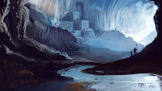
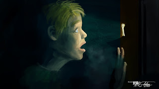
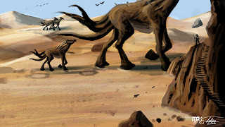
For those that follow my work regularly, they know that my artistic skills have improved over the years. However, when I look back at my past work I still see the potential those composition had. Leonardo da Vinci once said, "Art is never finished, only abandoned" but instead of living with that abandonment I have taken it upon myself to revisit my older works and improve them to make them stronger.
 
Before and After
Wishful Thinking

 Before and After
Grand Priestess of Cthulhu

 Before and After
Cthulhu's Rising: Humanity's Defiance

Before and After
Grand Priestess of Cthulhu 2

Of course I started these revisions off with my Lovecraft pieces as that is something I specialize in, but there will be more revisions to come and they will cover a more variety of subject matters. Feel free to ask any questions you may have and also don't forget to visit my new online store in which you can purchase these paintings as full size prints or as other products such as coffee mugs, skate boards and more!

Check out more of my work at Tobias White Illustrations
You should also follow me on Facebook, linkedin, Deviant Art, or catch me at @TobiasWhite1
Don't forget, you can also purchase many of my works as full sized prints at TBW Designs On Zazzle

Wednesday, August 8, 2012

The Cast of Bubba Beef Jerky and the rejects.

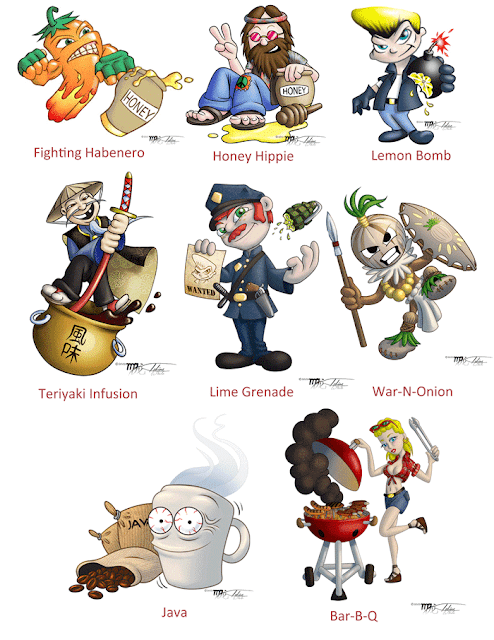
Let me introduce you to the cast of mascots from the new and up coming Bubba Beef Jerky line. I was commissioned by Bubba Beef Jerky, which is linked to Sunset Gaming, to create mascot s that represent a different flavor and it was my task to come up with different characters based on what my client wanted and my own interpretation of the flavor. While I haven't tried all the flavors yet, the ones I have tried have a good flavor and can pack some heat. Fighting Habanero is very spicy but has a great taste. Honey Hippie is mildly spicy but is coated with a honey glaze and if you don't mind sticky fingers can be quite tasty. Lemon Bomb is it's own unique tangy flavor and it is selling well. Teriyaki Infusion as you can expect tastes a lot like other teriyaki flavored jerky but it is a good one. I have yet to try the other flavors but I am most interested in trying out War-N-Onion and the Java flavor Jerky.
Doing these commissions and commissions with other clients I have really learned some of the challenges one might run into with dealing with clients and what they want. Sometimes, if you are lucky, the client know exactly what they want which can make your job a lot easier; which feels great to get in, get out and get paid. Although other times they might know a general direction they want to go with but they want feedback and or want to be presented with ideas with what they want; this takes a little longer but is workable and just requires a little coxing. Lastly there are the times when they have only a small idea of what they want but they can't think or communicate exactly what they want, this can often.

Often I have been told and I am now learning first hand is that communicating with your client is paramount before a job even begins. Do this even if you have a repeat client with whom you have been successful in the past. You need to know what kind of style they are looking for, what kind of feeling they want the art to project, and to have them describe what they want as detailed as possible. Also having examples of other art from other sources can help communicate the desires of your client.

If you are just starting out like I am, one of the things that you must expect is to get a lot of ideas rejected and so be ready to submit a large amount of ideas to your client. A good idea is to send you client sketches or comps of a variety of ideas that encompass what they want plus it is a good idea to add you own ideas of what you suspect they want but they were unable to communicate that idea or didn't think of it. From there you might even have to do a second round of sketches but of refining from the ideas they did like. Down below you can find a variety of sketches I submitted that got rejected from being Bubba Beef Jerky Mascots and they only represent a fraction of what got turned down.

Just remember that you are basically a gun for hire in the art world so if you take a job then you need to do what you client wants and sometimes that require you to wade through a lot of ideas.

Check out more of my work at Tobias White Illustrations
You should also follow me on Facebook, linkedin, Deviant Art,  or catch me on Tweeter at @TobiasWhite1
Don't forget, you can also purchase many of my works as full sized prints at TBW Designs On Zazzle


Monday, July 23, 2012

Orange County Art Walk

A brand new website has recently been released by the fine folks at House of Designers. Within a simple click you can find yourself at the OC Art Walk, a site devoted to artists who reside in Orange County of Southern California. There you will find out about local OC art headlines, events, features and profiles of artists in Orange County.

The OC Art Walk's site is cleanly made, easy to navigate and has a little Razzle Dazzle but not enough to slow down the site from downloading.  The first artists that have the honor to be profiled on the OC Art Walk include Elena Bulatova, Teresa Shippy, Noemi Barajas, Abraham Acosta, Jessica Jo, Tobias White, Jaime Johnson, Steev Creeper, Paulina Ruiz, and Michael McGinn.

OC Art Walk's ultimate goal is to help the artists of the OC to gain exposure and to create a stronger art community. So come on by and check out the OC Art Walk , and if you want to always be in the know then hop on over and 'Like" their Facebook page, so you can be kept updated with their headlines and to help support their noble cause.


P.S. All you artists of the OC come on by contact the site and help this site grow and help strengthen our art community!

Check out more of my work at Tobias White Illustrations
You should also follow me on Facebook, linkedin, Deviant Art,  or catch me on Tweeter at @TobiasWhite1


Monday, July 2, 2012

Speed Painting Techniques Act 3

Continued from Speed-painting-techniques-act-2

It was one thing to talk about the techniques of speed painting and another thing to watch it happen. So I finally decided to record one of my speed painting sessions. This painting was done in an hour but I have sped it up so that it is only 8 minutes long. For best results watch it at 720p HD or higher, although if you do, depending on your connection speed, you may want to let it load a bit, so that it plays smoother. If anyone has questions I am willing to answer.


Check out more of my work at Tobias White Illustrations
You should also follow me on Facebook, linkedin, Deviant Art,  or catch me on Tweeter at @TobiasWhite1

Saturday, June 30, 2012

Speed Painting Techniques Act 2


Continued from Speed-painting-techniques-act-1

As from the previous speed painting post I said that I was a bit rusty, but thanks to the daily speed paint challenges from da-speedpaint on Deviant Art I not only knocked that rust off, but I am now oiling the squeaky wheel!
One of the big mistakes I think I have done was to try and sketch out a speed painting. Sketching is not a bad thing for speed painting, but I have found that I would get caught up in the sketch, which in turn, would eat up time and then I would get trapped by the sketch. If you do feel the need to sketch then keep it loose and keep it fast and keep yourself unconcerned about detail because that is not what speed painting is about.

Another tip I found to help my speed painting is not be afraid of using loose references. Go ahead and do a fast google search for the topic you want to paint. Grab one or two of them and set them up on your screen next to your blank canvas. If you have a Poser you can set up quick poses and render them out as references as well. I found that it also makes it a bit easier to drop such references into a blank canvas that is the same dimensions as the one you are working on. By have loose references you free your mind up a bit so that you can just react and counter-react to how you are painting. When using references in speed painting it is wise to not and try and match the color of your reference because odds are you are going to make changes anyways, so close is good enough. 

Lastly when you start a speed painting, don't be afraid to be a bit sloppy while you block in your shapes. It is best to throw down as much of the color and general shape of what you are painting first. It is kind of like planning out a pallet and composition stage. Once you have everything laid out for positioning and color pallet you can then go to town and refine your painting for the rest of the time you have allotted yourself.


Check out more of my work at Tobias White Illustrations
You should also follow me on Facebook, linkedin, Deviant Art,  or catch me on Tweeter at @TobiasWhite1

Tuesday, June 19, 2012

Speed Painting Techniques Act 1

Part 2 continued from SpeedPaintingForProgression

A while back I had let my speed painting skills rust a little bit, so when I jumped back into speed painting I found my self struggling. However, I am getting back into the swing of things and so I thought I would talk about techniques I have been relearning and relearned.

 One of the techniques I have learned to improve speed painting is to use a variety of different brushes, brush size and opacity. If you have Photoshop C5 or higher than the pressure sensitive opacity toggle in your brush control bar is very useful for this. By doing this you keep your strokes from looking the same overall. This also helps you create detail with out getting nitty gritty which wastes time and our goal is to paint quickly
Another technique is one I learned from Cliff Cramp. By laying down local color first and then applying an overlay of color you can create shadow and light rapidly. This also will keep your work unified. In Corel Painter you would want to use digital water, but in photshop you do it with layers. One layer will be set to Soft Light or hard light (at 60% opacity) for my light sides and the other layer is set to Multiply (at 75% opacity). However, while this technique I was taught was generally taught for longer paintings I found it greatly speeds up a painting because it
takes out some of the thought process.

In combination with the overlaying techinque when you paint your local colors you will want to just block in the general shape of what you are painting. Think of the shapes as silhouettes. If you feel that you must sketch out the form from the inside then keep it as simple as possible and then block in a little bit with in that form. When you do the overlay technique over this you will get near instant volume to your painting.

Lastly keep in mind that this is a speed painting so set a timer of some sort: one that you can keep track of. When you are nearing the end of your time this is the time you use to clean up or to throw in those last needed details for your painting to be done.


Check out more of my work at Tobias White Illustrations
You should also follow me on Facebook, linkedin, Deviant Art,  or catch me on Tweeter at @TobiasWhite1


Wednesday, June 13, 2012

Texture Hunter Act 1

 One of the many techniques that digital painters employ is the use of texture overlays. Usually these textures are applied over a certain part of a digital painting with reduce opacity or using color blend modes such as multiply, overlay or soft light. The digital painter then paints over these textures to blend it even more into the painting.

You can find plenty of sites on-line that offer textures for sale or even for free. However, in these times of cell phones that can take quality photos and digital cameras that fit in your pocket, hunting your own textures is easy, rewarding (for uniqueness), and fun. If you pursue it everyday you will soon have a vast library of textures to use for your digital painting.

To be a successful texture hunter you need to actively be kept aware of your surroundings; look for differences in contrast; look for differences in color; and to think out side of the proverbial box. For instance the very first photo was from an ash tray at the Getty Museum, which was pretty funny to see someone taking a picture of at a museum. You can hunt for a lot of textures right in your own home; try looking in your refrigerator, garage and backyard if you own one. Things we take for granted like the fiz from a soda or the reflection of light in water can also make for great textures. Think beyond your ability to see and use your scanner (if you own one) because most scanners these days can scan at very high resolutions which make them almost like magnifying glass or a microscope. Using a scanner in this way can open up a world of textures we normally can't see. For example: tearing apart a Q-tip and scanning it or stretching a kneaded eraser.  Lastly the best source for texture is mother nature because she can produce things that can't be produced anywhere else, so keep your eyes open and get to hunting.


Check out more of my work at Tobias White Illustrations
You should also follow me on Facebook, linkedin, Deviant Art,  or catch me on Tweeter at @TobiasWhite1

Tuesday, June 12, 2012

Evolution of Cthulhu

 When I began getting into digital painting I decided I needed not only be able to do a variety of things but to also have a niche at something I would be really good at and known for painting. Cthulhu one day caught my eye and that started my niche and my love for the works of H.P. Lovecraft. Through the natural exploration of being known as Cthulhu and the progression of my artistic skills I have watch him seemingly evolve slowly over the years as I explored his form. From this I learned how much variation and exploration can be done in visual development which is the career I now pursue. From top to bottom you can witness how much and how many different forms I went through to get to his latest incarnation. I also learned not to work in a vacuum and found that the more research you do for a certain project the easier the process. Such reference include photo references of similar things and reading up on the descriptions of the original author. In fact one of the best resources I found was sketch that Lovecraft did himself of Cthulhu and it helped me form my own design. Cthulhu will probably continue to evolve for me but I glad for that as it will keep me fresh when it comes to visual development.


Check out more of my work at Tobias White Illustrations
You should also follow me on Facebook, linkedin, Deviant Art,  or catch me on Tweeter at @TobiasWhite1

Monday, June 11, 2012

Speedpainting for progression

 Almost all digital painters know what speed painting is and I am sure that speed painting is even practiced by other painters as well. There are no real rules when it comes to digital speed painting except do it fast as possible. A speed painting can take from anywhere from 15 minutes to paint to 2 hours, although some people like to take as long as 3 hours. There are plenty of arguments out there what the max time for a speed painting, but in reality --- it is all relative to the size or complexity of composition of the painting. Some ask why do a speed painting other than the reason for showing off. Well there are a variety of reasons. First off, time is money and if you can create a quite composition in as little as time possible then you can save time and earn more money. Another good reason to do speed painting is it is intense training designed to sharpen the compositional skills of the artist. Being able to speed paint is also vital for visual development in a variety of industries because visual development is about getting out images fast in order to communicate a visual idea that we as artists have in our heads. Lastly from my own experience some of my best portraits and other paintings have started off as a speed painting but which I just moved forward on. The reason I believe this to be so is because I am not thinking of what I want or need to do but instead I react and counter react as a speed painting I am doing develops.  Also when I am working on a speed painting I usually like having some kind of loose photo reference(s) as this allows me to react without having to think to much.


Before (1 Hour Speedpaint)
 After (2 Hours more)


Before (1 Hour Speedpaint)


 After (8 Hours more)


Check out more of my work at Tobias White Illustrations
You should also follow me on Facebook, linkedin, Deviant Art,  or catch me on Tweeter at @TobiasWhite1

Saturday, June 9, 2012

Fanart with Loving Care

 I am a serious illustrator and fanart work is not always taken seriously. Why do you ask? That is something I can't really explain because so many people have different reasons why it shouldn't. However even those that feel that it shouldn't be taking seriously still like to look at fanart, especially when it was done with care and skill. In addition, if an artist does some fanart I find usually the skill they develop from its practice increases quite a bit if they are a true fan. Although I haven't done a piece of fanwork in a long time I have done a lot in the past in order to hone my skills as an illustrator and digital painter. Doing fanart for practice is a great way to pass the time and as well as connecting with other fans. I have no favorite but the top one is a wish I hope would come true even though Christopher Nolan always says he won't do another Batman. As you can see my choices in what I like to watch ranges quite a lot and this is just the tip of the iceberg.


Check out more of my work at Tobias White Illustrations
You should also follow me on Facebook, linkedin, Deviant Art,  or catch me on Tweeter at @TobiasWhite1